Welcome back.

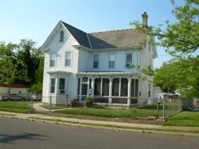
This week we will be continuing with the painting of the (West) Cape May Victorian house. The photo that I’m using is seen directly below.

I am doing this piece in my usual acrylics in an 8×10 format.
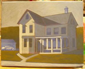
When last seen, the painting appeared as it does in the photo seen directly below.

Since that time I have continued to work on the painting.
I have now made the structure to the left left grainy and more solid. The blue is a bit darker. The Nash (car) has been revised as well. There is now a marked contrast between the lit and shadowed portions.
Also receiving attention is the roadway, now a bit whiter. This has been accomplished with several thin layers of paint. The lawn is a bit brighter with deeper shadowed areas. The edges have newly darkended shadowed areas. The foliage to the left rear has now received highlights on its upper portion. A deeply shadowed area resides below.
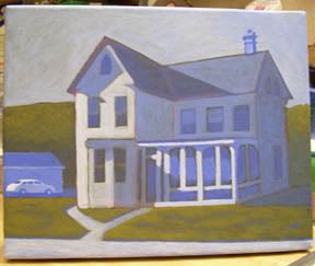
And with that the painting is done.
The current state of the painting is seen in the photo directly below. (The white balance now having been corrected.)

That’s about it for now. I’ll see you next week with a new painting. As always, feel free to add photos of your own work in the comments section below.


Paint me a picture of your thoughts.
interesting change vis-a-vis the white balance correction b2. the painting is now much bluer than the earlier images….which, to my eye, had a more sepia-like tone…l’m surprised the difference it makes in the perception. l hesitate to say it’s right or wrong, but the warmer hued version l tend to prefer.
an aside re: rendering/painting/etc widows…one of the “tricks” l learned in doing architectural renderings is to treat them like mirrors. they reflect what isn’t necessarily seen in the photo/image. another one is to use them as true “widows” and show glimpses of what’s inside….they’re diffucult to do, in either case.
as always, its a pleasure to see the progression of your work.
keep it up!
Thanks, dada. That sounds like good advice. In some aspects I become to closely wedded to the source material. But you’ve been holding out on us?!! Architectural renderings! Could I tempt you to post one?
l’ll have to scan something…someday…:{)