
Welcome to Friday Foto Flogging, a place to share your photos and photography news. We were inspired by the folks at European Tribune who post a regular Friday Photoblog series to try the same on this side of the virtual Atlantic. We also thought foto folks would enjoy seeing some other websites so each week we’ll introduce a different photo website.
This Week’s Theme: Differences. Between photos, within photos. Differences of any kind, including content, equipment, setting, or even your mood.
Website(s) of the Week: Parting Glance: Irving Penn by Niko Koppel/NYT and Photographer Irving Penn dies, aged 92 by Mark Tran/Guardian.
AndiF’s Differences
 |
Never the same place
Click image for larger version |
 |
Past and present
Click image for larger version |
 |
Split Screen?
Click image for larger version |
olivia’s differences
 |
Click image for larger version |
 |
Click image for larger version |
 |
Click image for larger version |
Next Week’s Theme: What moves you? Be it literal or abstract.
Info on Posting Photos
When you post your photos, please keep the width at 500 or less for the sake of our Bootribers who are on dial-up. If you want to post clickable thumbnails but aren’t sure how, check out this diary:
Clickable Thumbnails. If you haven’t yet joined a photo-hosting site, here are some to consider: Photobucket, Flickr, ImageShack, and Picasa.
Previous Friday Foto Flogs

And a quick note to let you know that both Andi and I may not be around much this w/e. Andi will be playing hostess 😉 … and for me, it’s Cdn Thanksgiving.
Happy Thanksgiving, O.
I’m actually playing host away from home and probably won’t have any internet access between this afternoon and Sunday evening. But I’m sure there will be lots of great photos for me to see on Sunday night.
Thanks … 🙂
I’m going to be w/out internet for most of the w/e too. Looking forward to seeing everyone’s flog photos on Sunday. And, hearing about your visit (and seeing any pix you take while visiting too … :D).
Happy Thanksgiving!
Thanks CG! I’m looking forward to good food this w/e, but it’s supposed to rain … rain, rain, rain. 🙂
Enjoy your Thanksgiving. 🙂
Thanks Bob!
And as a bonus treat, a difference in technique. :p
Wow! You get the most amazing views. Gorgeous colour.
And with the bottom photo, it looks like that piece is sitting on top of the photo, 3D-ish. How’d you do that?
I don’t know! Lol, actually I have a pretty good idea and you’ll be able to see in a little bit when I upload a different version of the same shot with different processing, no desaturation and what I think the key is to the 3D-ish appearance, no blur.
I always forget to use blur in my photos but blur will often force your focus onto an area of the photo that you do not enhance (or dehance, I suppose) with a blur effect.
It really makes that piece stand out, doesn’t it? And personally, i think I took the blur a little too far although it is kind of freaky, isn’t it?
I don’t know! lol … 🙂
The background almost fades away in this photo … I wouldn’t have thought blurring. Very interesting! Looking forward to seeing the different version.
I kind of don’t because I haven’t really figured out a proper and reliable workflow for this yet.
As such, the path I take from start to finish isn’t consistent and I often adjust and re-adjust something only to adjust and readjust it countless times as I change some other variable. That’s to be expected, but the preparation from RAW conversions, using TIFF’s and such that I haven’t gotten down yet may help make the process more fluid.
As is, without a workflow, you end up sometimes with wacky shots that though they look neat, there was no format followed…
Do you always convert to tiffs? And is that b/c you do the initial tweaks w/ Nikon’s CaptureNX?
Once you get a formula, you can save your steps in an action. Have you done that yet?
Converting to tiff’s is completely new for me and I’m not even sure where to start. Using photomatix, it converts a single image to a pseudo-HDR first. From there, I’m viewing and adjusting it. Then I apply the “process” at which point I can save as 8 or 16-bit tiffs or a jpeg.
I’m thinking I should just convert my .NEF to a .TIFF first and foremost and the tiff is also a lossless data file that can still be used to tonemap, create HDR, etc.
I just haven’t gotten there yet. One problem with tiffs is that they also tend to be HUGE files, especially after post-processing.
For what we seem to be doing I’m not sure there is a proper work-flow that could be saved and reused.
This is a neat shot, so is the “pawn” above. The background blur actually drew me into the background to explore the entire shot. It is an entirely enticing effect to get me to study the photograph further.
The blur effect is a touchy one. Several people I spoke to liked the blur, and several people didn’t like it. It can work both ways depending on the scene.
I’ve only used it a handful of times as I don’t think I’ve really grasped how it can be an effective tool for drawing a viewer to one aspect of a picture.
I think this was the last picture I applied blur to. It was a much more subtle application of it and I think it works well here.
For some reason unknown to me, I’m beginning to view your wonderful creations in terms of illustrators. Although the medium is different, the cityscape subject reminds me a bit of one of my all-time favorites, Moebius and the kid in the phone box appears, at least to me, sort of Norman Rockwell with maybe a slight touch of the seedier side of town thrown in. FWIW, I think you have an intriguing & special talent!
I’ve never found myself to be artistic in terms of visual arts. I used to play bass, self-taught and was pretty good but as an art, that was the only one I ever had a knack for.
The photography, again self-taught via research, practice and experimentation with technical questions bounced off those with more under their belt, though an art, I haven’t really ever looked at it that way until recently, when I’ve began thinking more and more about shots and scenes, more often than not without my camera than with.
I’ll take the Rockwell comparison very humbly while pointing out that the phone booth shot was completely off the cuff. I didn’t even try to expose it properly initially, instead choosing to just throw it on aperture priority, giving a quick look through the viewfinder (as I was rushed), and firing off one shot.
Thanks for the comparison/compliment, nonetheless. Reading it certainly opened my eyes this morning!
🙂
So I thought about it and the “I don’t know” is more a result of an inability to tell you exact settings I used, etc.
What I did do is thus:
To give you an idea what the original shot looked like, here’s someone else’s picture of the same piece. My angle and lighting is different but that’s less of a huge concern otherwise considering what I did to the image.
I worked the initial color image through Photomatix and Photoshop, for the gritty, detailed processing on the game piece that allowed for all the physical details of the piece to show up more. I then saved it as a tiff and opened it in Photoshop CS4, where I further tweaked the white and black limits, clarity, tones, and curves to achieve that final gritty result seen above in my shot.
I then duplicated that layer and applied a layer mask to the duplicate. Then I stripped the color out of the image by desaturating it. The next step was applying a black brush to the game piece area, going through the layer mask and allowing me to pull up the color from the bottom, original layer.
Essentially at the shot you see above, I then applied blur (a lot of it) to the top layer again, which allowed the game piece to stay sharp while muting the background.
And that’s how I did it.
“If I did it….”
;p
Great color but what I especially like is the movement of the sun into and out of the photos.
Interesting effect.
or the raw advantage. This is what happened when I wasn’t paying attention to the settings on camera and the difference editing can make. All of these were shot with a Nikon D1X, raw-high setting and edited with Capture NX2. I’m not sure they could have been saved to this extent if they were jpegs. The raw advantage is that all of the information is stored, all one needs to do is retrieve it from the raw data, by changing the camera settings after the photo is taken. Of course there are limits, and this doesn’t work all the time.
Large size for detail is here.
http://bobx327.deviantart.com/art/Pardon-Slough-Mosquito-Lagoon-113524853
Great take on the theme Bob! The before and afters are good to see. Do you always shoot in raw or just for certain situations? I’ve found that it’s hard to go back to jpeg since I switched.
Love the framing in the second shot – between the trees.
Raw only, I really see no reason to shoot anything else unless I’m running out of space on the card, but I’ve always a spare on hand. The raw can be converted to anything and the bloopers are much easier to fix with NX2’s camera control and picture control.
Thanks for the comment, I took that not knowing if it would work or not.
That’s what I like about the HDR and tonemapping programs like Photomatix. They’re great for creating hyper-realistic and unnatural scenes but they’re also great for recovering underexposed areas in ways you wouldn’t normally think we’re possible until you actually see it for yourself.
I also only shoot RAW for the sheer amount of leeway you have with regards to image variables without corrupting the data beyond recovery.
IOW, let’s say I shot a picture with a point and shoot but the image didn’t perceive the light properly. With a JPEG, I can try to readjust the white balance but it might not come out the way I want without creating noise or other visual image problems whereas with RAW, you juts select the WB setting you want (or provide minor step adjustments) and set the mood and color either how You remember it or where you want it for a specific shot.
Anyone shooting under street lights at night will find this a constant problem due to the sodium vapor or similar lights casting an orange glow in their pictures.
I noticed it too when I was taking hockey photos — continuous burst action photos under those lights would render as slightly different lighting based on the colour wavelengths or something like that (searched it out to find out why it was doing it). Easy to tweak that with a raw image.
Yeah, high pressure sodium and mercury vapor can be tricky. I’ve also used white balance as a tool to quickly warm a shot that was too cold or to set a mood.
l shoot everything in RAW, but still learning the saving tricks in PS.
what color space are you using….cam setting. l’m using the Adobe RGB setting in the cam [canon eos 350d…rebel xt] because l get much better prints from it, although l’ve read it may render differently on some monitors. l’m on a mac, and personally, haven’t had any problems.
I’m using a Nikon sRGB in camera and in Capture NX2 and printing from NX2 to a Canon ip4500 in raw format, these are the factory defaults from Nikon. The Nikon sRGB seems to be more color neutral, for whatever reason adobe color spaces seem to over-saturate reds and turn subtle blues more teal for me. What I see on the monitor is what prints so it’s not a calibration thing. I get excellent prints up to a full sheet(8.5×11). Anything bigger goes out to the photo printer to the big Epson printers, which have not been to my satisfaction, mostly because of the 6-10 megapixel size limitation, not being sharp enough. Although lately I’ve been playing with Auto-Pana Giga to make larger stitched prints to 60-100 megapixel while converted to tiff. I haven’t printed any yet because of the cost, but on monitor they look great at 100%.
Really fun way to do the theme. I really like seeing the adjustments you made. The bottom photo is my favorite — love the deep green against the blue ocean.
Very nice! Enhancing without overwhelming.
differences: 1 rock, 2 seasons
spring monsoons
winter snows

clik to enlarge
Oooh, I like that. You’re lucky to have that beautiful geography. 🙂
Nifty shots. Love the snow shot for the way it etches the the lines of the rock.
Majestic and timeless – nice!
Seasonal Differences of a Landscape
(click images for larger versions)
April 2, 2009

June 19, 2009

Aug 20, 2009

Sept 28, 2009

With thanks to dada for the inspiration!
Ooooooo. Sweet.
Very nice contrasts of land and sky as painted by the seasons.
l really like the openness of that environment…big skies and long, far away horizons.
l especially like the 20 aug shot. the lighting and massing thunderstorm has a beautiful, yet foreboding, visage.
well done sir…kudos
Those are wonderful. I can’t pick between April 2nd (April 2nd!) and August 20 for my favorites but I think I’m leaning toward the August picture for the gorgeous light on the fields.
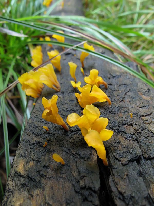
Andi, the yellow fungus is really interesting I don’t recall ever seeing anything like it. Nice fungi shots from olivia also!
I hadn’t seen anything like until this year, ID. It’s all part the fungus abundance of this summer and fall. I’ve really found it all fascinating.
Too bad old Judge Rosen isn’t still with us. He’d have had enough material for a sequel to his mushroom book.
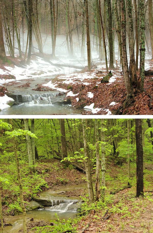
andi, l really like the top image in your first shot with the mist rising. the lighting and deep dof is superb.
l can feel the cold…though that might be partially due to the gray skies and 25º temps outside.
great capture…kudos
I’ve just been visiting with some old friends this weekend, including one who lives in Estes Park and how nice and warm it was here — even though we had frost. Meanwhile the friend who lives in Florida was freezing.
Wow, Olivia and Andi. Great fungi shots. Especially those yellow jelly fungi, Andi.
I’m late to the party, with but one offering, which I spotted on the daily orchid walk yesterday: flora/fauna.
ARACHNOPHOBES beware (.2 inch spider)
Beauty and the beast. 🙂
I love that purple color — and the delicacy of the petals.
Much better title. We’re still seeing more orchid buds than flowers – the explosion should happen any day now.
Unfortunately, between the wind and the deluge, we’ve had several trees come down – including one really big (a least 80-100ft tall) Eucalyptus viminalis. Mostly they’ve all fallen on the track. Which makes getting around the place a bit more interesting.
the explosion should happen any day now.
I hope you’ve got your Nikon back.
I hope you’ve got your Nikon back. Not yet. 🙁
When I called to check up on it late last week I was told that they were going to do the repairs (yes plural, it took multiple problems for me to part with it) early this week. My little Canon Powershot actually took the above shot – which is not too shabby, but has nowhere near enough depth of field.
We had two sunny days and now the clouds are back. If the trees don’t get a chance for their feet to dry out I’m afraid more of them will topple in the high winds. If it’s not one thing, it’s another . . .
Sorry about the camera. I hope they hurry up and get it back to you very soon. In the meantime, I’ll be grateful that you have the Canon to share the orchidpalooza.