Hello again painting fans.

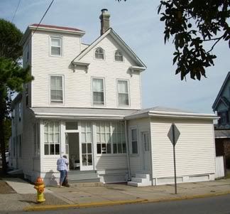
This week I’ll be continuing with the painting of the towered Cape May house. I will be using the photo seen directly below.

I’ll be using my usual acrylics on a small 5 by 5 inch canvas.
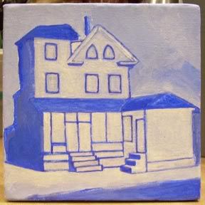
When last seen, the painting appeared as it does in the photo directly below.

Since that time I have continued to work on the painting.
Looking at the original photo, I decided that the far left side, seen in shadow, was best handled without showing details such as the windows. In other words, it would be painted as thick, obscuring shadow. But that meant other shadows should be consistent. That included the shadow draping toward the double front doors. And then it occurred to me that this could be a much more dramatic image. Suddenly the painting took a turn that I had not envisioned.
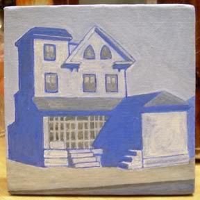
I did indeed paint those heavy shadows described above. Also complete are the double doors, windows and the siding surfaces. All of these elements are handled in a manner that is consistent with the heavy shadows. The roof sections appear in the same gray as the windows and double doors. Finally, the street and sidewalk have been painted in grays with some blue highlights.
The current state of the painting is seen directly below.

That’s about it for now. Next week I’ll have more progress to show you. See you then. As always, feel free to add photos of your own work in the comments section below.
Earlier paintings in this series can be seen here.


Paint me a picture of your thoughts.
Boran2,
I like that.
The shadows make the building architecture much more crisp, yet does not take anything away from it.
Smooth move
Thanks Knucklehead!