Hello again painting fans.

This week I’ll be continuing with the shadowed Cape May house. I will be using the photo seen directly low.
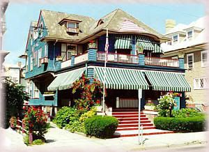
I will be using my usual acrylics on a somewhat larger 8 by 8 inch gallery-style canvas.(This is a thicker canvas similar to the one used in the towered house.)
When last seen, the painting appeared as it does in the photo directly below.
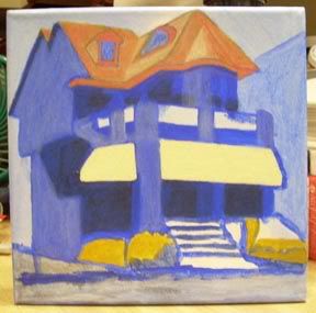
Since that time, I have continued to work on the painting.
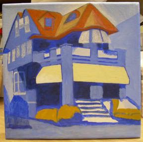
I’ve revised the roof which now appears with a bit more contrast between the forms of which it is comprised. The half cone and highlighted portion to its immediate left now appear more three dimensional. To the left, the third story windows have received their first layer of paint.
I then moved down to the second story awnings. The first layer of paint defines the shape they will take. I’ve also added shadows to the porch railings. Continuing on the second story, the windows to the left side now have their own first layer.
Moving down to the first story, I’ve added the window to the left side of the building. The awning to the left has been revised to appear consistent with the perspective of the building. It will need to be revised again before I’m done. Finally, the base of the house, long neglected, has had all of its elements put into place. The driveway and bushes will receive much more attention but the basic layout won’t change.
The current state of the painting is seen in the photo directly below.
That’s about it for now. Next week I’ll have an entirely new piece to show you. See you then. As always, feel free to add photos of your own work in the comments section below.
Earlier paintings in this series can be seen here.

Paint me a picture of your thoughts.
Bid early, bid often.
Nicely shaped up! I enjoy seeing the progress you make from week to week.
I am almost finished with the Veterans Day rug. I hope to finish the hooking today and maybe get the binding done, which is the final step. But that may take another separate day on a rug of this size.
I have actually finished the two sides and the top rail of the outer frame, but I couldn’t photograph it because it was too dark outside. I’m getting excited, as I always do at the end of a project.
http://i32.photobucket.com/albums/d27/Rughooker/DSC02655.jpg
Thanks! I’m looking forward to the photos of your progress!
Finished all of the hooking; now I have to trim the excess backing and turn the edges under to whip them with dyed wool yarn. Then it will be all finished.
http://i32.photobucket.com/albums/d27/Rughooker/DSC02670.jpg
Took six weeks to do from start to finish. I’m really pleased with it!
Wow Boran 2,
It`s really taking shape quickly.
I went to bid & it`s a hell of a lot of information they want, to take my dollars.
Thanks Knucklehead!
I believe that they’re guarding against people failing to follow up on bids. But it is for a good organization.