Hello again painting fans.

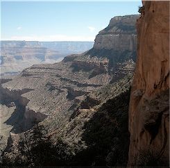
This week I will be continuing with the painting of the Grand Canyon. The photo that I will be using is seen directly below. I will be using my usual acrylics on a 12×12 gallery-wrapped canvas.
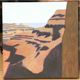
When last seen, the painting appeared as it does in the photo seen directly below.
Since that time, I have continued to work on the painting.
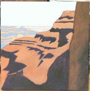
I took a good look at the painting after last week’s installment. I wasn’t really happy with the way things were going, and the scene was not being portrayed in a way that conveyed the sense of distance. The Grand Canyon is truly immense. My painting was not successfully accomplishing the aerial perspective that I had hoped it would. I then began a revision that would involve every element except for the dark shadows of the main butte.
Starting on the extreme right, the closest butte has a revised surface now featuring a concave section like that of the photo. Moving to the main butte, the entire medium brown area has been revised but, in all fairness, does not look dramatically different than before. Most notable is the reshaped top with a highlight at the tip. It was one of those things that happened during the revision that was not completely intended. I liked it and kept it. Further back are the heavily revised buttes to the left. They now appear in bright colors that some may find jarring. I feel that they better convey the distance even if the image begins to take on a bit of the look of a 1930s Park Service travel poster. To the far rear, the distant buttes make their first appearance in an even paler shade. I hope that the color progression is appropriate. I am much happier with this image now.
The current state of the painting is seen in the photo directly below.
I’ll have more progress to show you next week. See you then.
Earlier paintings in this series can be seen here.

Paint me a picture of your thoughts.
Right now it is such a pleasure to see something that isn’t snow or ice covered.
Your painting continues to come along nicely. This is a landscape where taking it slowly will pay off.
Thanks DD. It seems like this has moved slowly. Finally ready to move on to the sky.
The sky will pose its own challenges, including the cumulus clouds near the horizon, and getting the blues from horizon upwards just right. To my eyes, your canvas looks like it is well-set up for those challenges. Keep at it.
boran2,
Love it.
The distance perspective is perfect.
I almost commented on that before even reading about it.
I love the life you created with that concave in the near butte & tha subtle highlight on the secondary one.
Looking really fine & almost done but for the sky.
Thanks Knucklehead! I’ve actually completed it now and look forward to your comments next week.