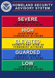
Washington Post contributing columnist Kate Cohen has a good idea for how to demonstrate the effectiveness of COVID-19 vaccines. It’s basically just a graphic. The idea is to make the graphic ubiquitous, as familiar as the Bush administration’s color-coded terror threat charts from the early post-9/11/pre-Iraq invasion days.

But instead of advising us how likely we are to die of a terror attack, the new graphic would be a running tally of how many Americans have died of COVID-19, broken down into two columns: vaccinated and unvaccinated.
For example, “the Associated Press, using figures provided by the CDC, found that of the more than 18,000 Americans who died of covid in May, only about 150 were fully vaccinated. That’s 0.8 percent.”
She also suggests that each state can make their own graphic. Maryland’s chart for June would read 130-0.
The point is in part to counteract arguments that the vaccinations are not effective since there are fully vaccinated people who have died of COVID-19 infection. But that’s a secondary consideration. The goal is to get people to get the shots, and arguments aren’t making much headway. Sometimes a visual aid is much more effective than verbal instruction.
It’s also conserves energy. Who wants to make the same belabored points over and over again, especially when the audience is hostile and hypersensitive to condescension? It’s almost effortless to flash a graphic that shows “between Jan. 21 and July 9, 2,471 Virginians died of covid; 18 of them were vaccinated, or 0.7 percent.”
This wouldn’t obviate the need to explain the facts, counter misinformation, and appeal to people’s moral sensibilities, but it would aid in those endeavors while seeping into the subconscious of America.
A new Axios-Ipsos poll finds “30% of U.S. adults in our national survey said they haven’t yet gotten the COVID-19 vaccine — half of them a hard no.” They say that nothing, not their doctor’s recommendation, not a celebrity’s endorsement, not a paid day off of work, will convince them to get inoculated.
Some people will respond to those kinds of incentives, but for the rest the only hope is that they respond to a different kind of persuasion. One nice feature of Cohen’s idea is that it transforms each breakthrough COVID-19 death of a vaccinated person from an argument against getting the shots into an argument for getting them.
On the other side of the ledger will be people like former Bourne, Massachusetts Selectwoman Linda Zuern who spent the pandemic promoting QAnon and hydroxychloroquine, and telling anyone within earshot that COVID-19 is the globalists’ plot to usher in U.N. Agenda 2030 and create a “one world government.” She died on Cape Cod on Friday after contracting the virus on a trip to South Dakota. Her death was unnecessary, and it gets counted in our graphic in the unvaccinated column along with over 99 percent of the other victims.
I think it would be helpful if newspapers, television news organizations and the government (state and federal) used a graphic like this. Maybe it could have broken through to Linda Zuern. If not, it at least would have made her less convincing when she argued against vaccines.


“between Jan. 21 and July 9, 2,471 Virginians died of covid; 18 of them were vaccinated, or 0.7 percent.”
I think for purposes of persuasion, it is important to stress how many unvaccinated die. That is, if one states that 0.7 percent were unvaccinated, you are requiring the reader to do a little math to understand that 99.3% were unvaccinated. Reverse that: 2,453 were unvaccinated: 99.3%.”
It far too late for any of that. It’s been far too late since Trump basically said only massive fucking cowards get the vaccine.
Besides, the people who you’re trying to reach already believe that 99% of people who get COVID without the vaccine survive. Saying that 99.3% of people who get the vaccine survive sounds a whole lot like 99% of people who get COVID without the vaccine survive, thereby cementing their own morality in choosing to catch and spread COVID to own the libs, and for freedom.
Let’s be clear here: the people who have decided not to get the vaccine by now aren’t going to unless they are required by their employer. It’s far too late to convince these people of not killing themselves and the people they’re around out of good citizenry or morality.
Until they catch this bug and think they are about to die, then the tune will turn for them and their family.
How about we just start having companies, sports teams, and concert venues just start requiring vaccinations to enter the premises. We have two very large hospital concerns in the area where I live. Both are requiring all employees to be vaccinated. That’s right — get vaccinated by a certain date or find a new job. Start getting major corporations on board (just like they do with the United Way) and work on the MLB, NFL, and NBA and you’ll start seeing vaxx objectors crawl back under their rocks.
Indeed. I have wondered if the privatized health insurance system we have might not be a bonus: can insurance require vaccination? I am thinking it must run up against some regulation or another, but I don’t actually know.