
Welcome back.
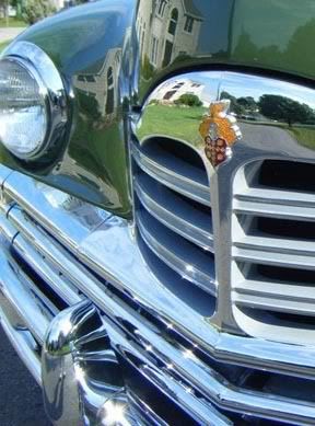
This week we’ll be continuing with the painting of the grille of a 1949 Packard automobile. The photo that I’m using is seen in the photo directly below. I’ll be using my usual acrylics on an 8×10 canvas.
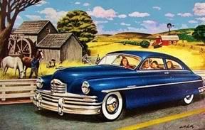
Seen in a vintage illustration directly below is the entire vehicle showing the grille in
context.
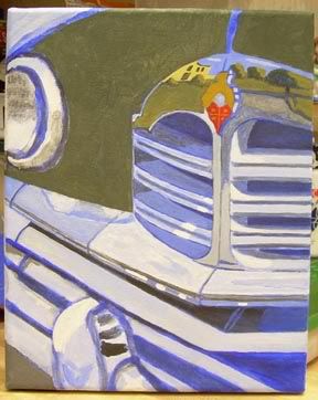
When last seen, the painting appeared as it does in the photo directly below.
Since that time I have continued to work on the painting.
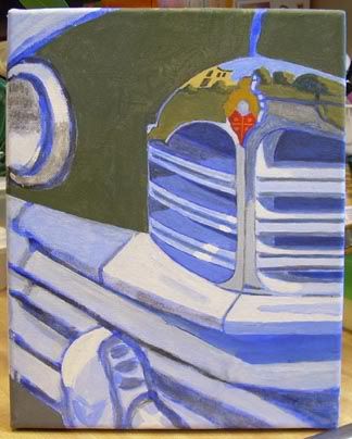
I’ve concentrated most of my efforts on the wide chrome area just below the central grill. Seen for the first time is a reflection to the left side of the bumper that is apparently the roof of the yellowish house reflected in several other surfaces. Also depicted is the rather deep blue sky. The remainder of the upper bumper has been painted in blue and white areas as seen in the photo.
The edge of the bumper has been painted in lines of blue, white and gray. I am not completely satisfied and will revise this slightly.
The current state of the painting is seen in the photo directly below.
That’s about it for now. Next week I’ll have more progress to show you. See you then. As always, feel free to add photos of your own work in the comments section below.
Earlier paintings in this series can be seen here.
Paint me a picture of your thoughts.
as the risk of offense where none is intended, l’m gonna play critic here for a moment, so just consider this my 2¢…which is probably twice its’ worth.
that caveat aside, what’s lacking for me visually so far is the sense of depth that l see in the photo, and l suspect it’s from the use of primarily mid-tones…and greyed out colours…for lack of a better term.
when l look at the photo, l see a lot contrast between the black and whites which, to my eye, completes the full range of hues and colour densities. this not only “anchors” but completes the full spectrum colours offered by the subject.
rendering polished, mirror-like surfaces, ie: chrome, glass, and reflections in general, has always been a challenge for me. it became a bit easier when a co-worker looked over my shoulder one day and said “ya know, chrome’s got a lot of black and white in it” and used the example of the cylons in orig battlestar galactica series c. 1978. so l started using a lot more black and white for highlights. worked for me. might work for you too.
nonetheless, it’s still a challenging subject, and it’s very interesting to see how you interpret it.
No offense taken. I’m kind of feeling my way through this experiment. I’ll have to look carefully at the black/white contrast. It is a work in progress. 😉
What I see when I look at chrome is mostly blue and white. But that’s also a decent contrast and contrast is where most of the effect of reflection in chrome comes out. The trick is figuring out where to place the two colors in relation to each other, i.e., where sky meets earth in a chrome relection and so on. It’s capturing the realism of it that so difficult. Not so much the hues of the contrasting colors. For me it is, anyway.
respectfully :o)
That’s how I see it, mostly blue and white. But there are some very dark areas that would help create the illusion of chrome.