Hello again painting fans.

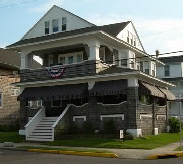
This week I will be continuing with the painting of the Cape May transitional-style house . I’m using the photo seen directly below.

I will be using my usual acrylics on a 12 x 12 inch gallery-style (thick) canvas.
When last seen, the painting appeared as it does in the photo directly below.

Since that time I have continued to work on the painting.
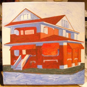
It’s a quantum leap this week. The house is nearly done and I’ve begun the background. I’ll run through the changes below.
The awnings are now nearly complete. Highlights have been added to all right-facing portions. The body of the house is now seen in shades of brown appropriate to the shingles in the photo. Once again, the right-facing portions have highlights. I will lighten these highlights a bit before all is done. These browns were built up from the prior red shade making for a rich color. Most trim is now (nearly) complete with highlights in white and shaded areas in blue. I’ll need to fade the blue of those right-facing second story windows a bit. They are just too bright. On the right side, the columns have been revised and the stairs have been repositioned.
The current state of the painting is seen in the photo directly below.

That’s about it for now. Next week I’ll have more progress to show you. See you then. As always, feel free to add photos of your own work in the comments section below.
Earlier paintings in this series can be seen here.


