Hello again painting fans.

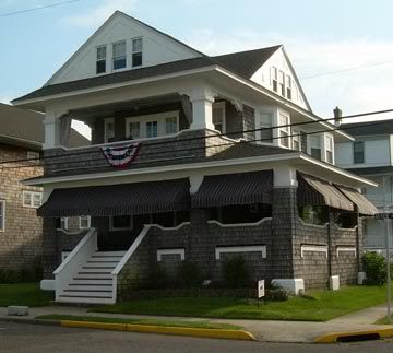
This week I will be continuing with the painting of the Cape May transitional-style house . I’m using the photo seen directly below.

I will be using my usual acrylics on a 12 x 12 inch gallery-style (thick) canvas.
When last seen, the painting appeared as it does in the photo directly below.

Since that time I have continued to work on the painting.
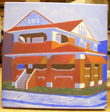
There are many changes this week, some large and others small. First of all, the sky is now done. The blue parts are deeper in color and there is a hint of clouds. The photo has actually lightened things a bit. The left-facing highlights of the house have been lighened a bit to provide more contrast. Also providing more contrast are the dark shadowed areas under the awnings. I’ve also revised the the left-facing 2nd story windows. They are now simpler and their color less jarring. Finally, I’ve sharpened many of the small details. The house is now nearly complete with only the steps needing some attention. On to the foreground/background.
The current state of the painting is seen in the photo directly below.

That’s about it for now. Next week I’ll have more progress to show you. See you then. As always, feel free to add photos of your own work in the comments section below.
Earlier paintings in this series can be seen here.


